

In our recent tutorial “Create your own custom view with Centreon”, Laurent teached you how to use the widgets correctly.
I would like to supplement that tutorial today by showing you how to use the Centreon MAP, Centreon BAM and Centreon MBI widgets to create dashboards which facilitate monitoring of business-oriented IT performance.
Whether you have one product or the complete Centreon EMS solution, the widgets make it possible to create personalized dashboards (custom views) to keep an eye on the health of your IT services.
Is my service ok? What has been happening recently? What are the potential risks? What trend can I expect? When can I schedule my maintenance slots? Is now the time to think about investing in new IT resources and, if so, internally or externally?
The answers to all these questions can be found in unified views by leveraging Centreon EMS widgets.
Follow our example of a mail service monitoring and discover how to be on top of your IT game!
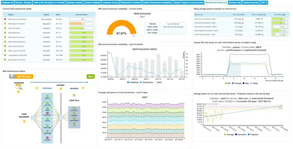
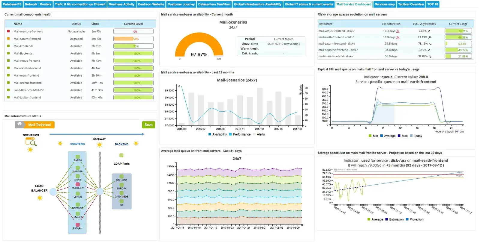
Example: With this monitoring dashboard of the company mail service, the IT teams are more reactive in case of service degradation and more proactive as regards planning maintenance to be carried out
With the Centreon EMS widgets you can create custom views combining real time and aggregated data, facilitating behavior’s analysis of your technical and operational indicators. Decision-making is then quicker and based on factual and precise data, allowing your SLA to be maintained.
Let’s imagine we were an IT team that needs to monitor the key indicators of the company’s mail service in a unified way to manage the performance of this strategical service. To this end, we are going to create a dashboard which will show the current and past status of this IT service and its components in the blink of an eye.
This example sets out some extra Centreon EMS analysis tools but it is not an exhaustive view of the functionalities of this solution or the mandatory indicators which must be monitored for a mail service.
Here are the Centreon EMS advanced functionalities we are going to use in our example:
- Centreon MAP: creation of a view of the status of the various components of the architecture supporting the mail service. More information on use of the Centreon MAP here.
- Centreon BAM: measurement and real-time display of KPIs status
- Centreon MBI: analysis of the availability of the mail service for the current month and evolution over the last 12 months
- Centreon MBI: monitoring of the performance indicators:
o Search for abnormal behavior on the mail queue of a critical server
o Evolution of the mail queue of all the mail servers
o Monitoring of the mail server storage space saturation risk
o Projection of the evolution of storage of a critical mail server
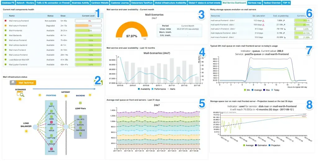
In our example, this unified dashboard integrates 8 widgets making it possible to have an exhaustive vision of the mail service: the level of current performance and the risks of deterioration incurred. The usefulness of each widget is described below.
Display of the status of the mail service infrastructure in real time (1 and 2)
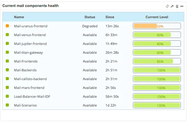
(1) Display of the status of the key indicators
We have configured Centreon BAM’s Live business activity status widget to show all the indicators impacting the service, choosing to display those presenting the poorest health first.
 will be displayed if an administrator/operator is in the process of working on resolving the problem
-
 will be displayed if scheduled maintenance is in progress
(2) Visibility on the infrastructure supporting the mail service
The view below was created with Centreon MAP and then integrated into the dashboard via the dedicated widget. The elements visible in this view come from both Centreon and Centreon BAM objects.
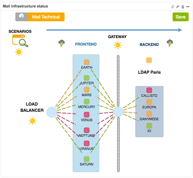
Thanks to these first two widgets, any incident occurring on the mail service can be quickly detected and its impact on users understood immediately.
As the main indicator representing user accessibility to the service is “Scenarios” (top left of the Centreon MAP view), we can see immediately that even if some components are showing errors or have been degraded, users can still access the service. By proactively resolving visible problems, any deterioration in email services over the course of subsequent minutes/hours/days is avoided.
(3) & (4) Analysis of service availability shows what has happened recently and facilitates SLA monitoring
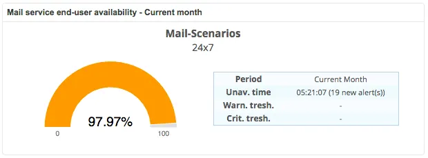
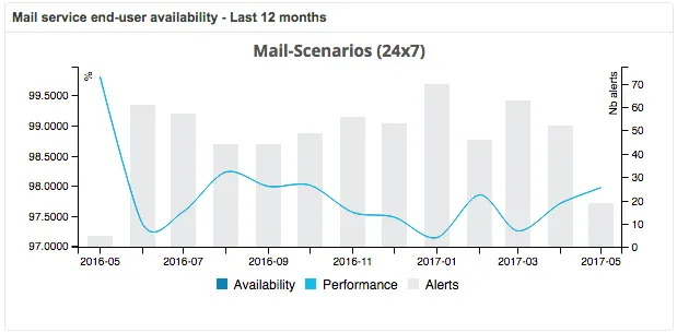
With the following two widgets, we can visualize availability of the mail service for the current month (3) and its trend in the past (4). Any deviation from the SLA will be visible immediately. Corrective actions can be taken over the rest of the month to improve this indicator (3).
Then, evolution of availability over the last 12 months (4).
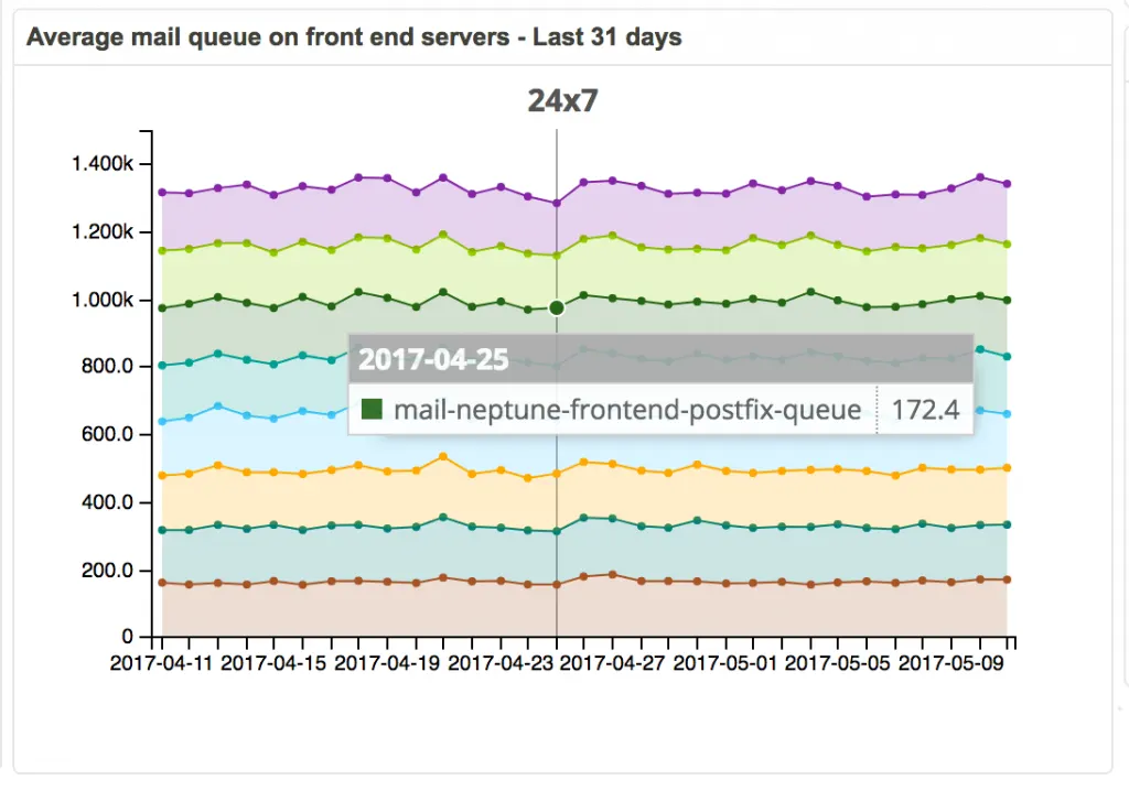
(5) Evolution by day of the mail queue on all servers
This widget allows us to keep an eye on the “mail queue” metrics of all the mail servers. By visualizing evolution of the mail processing speed, we can quickly see if one or several servers are demonstrating abnormal behavior.
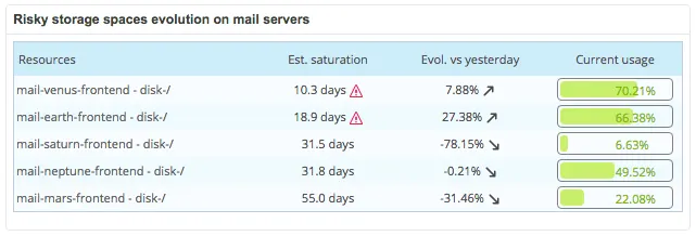
(6) Monitoring of mail server storage space saturation risk
Here we are displaying partitions identified as “risky” on the mail servers. Partitions which will soon reach their maximum are considered to be “risky”.
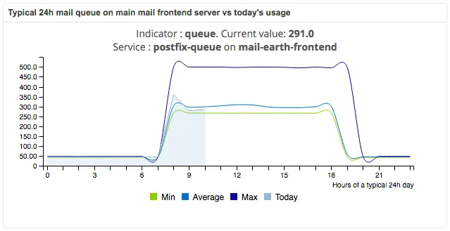
(7) Search for abnormal behavior on the mail queue of a critical server
This widget highlights the behavior of one metric on the current day compared to a typical 24h day.
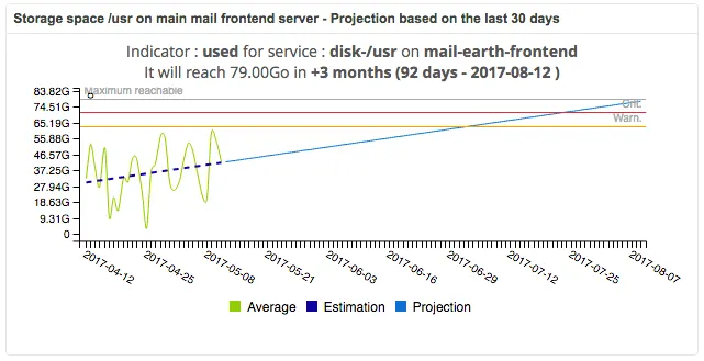
(8) Projected evolution of the storage of a critical mail server
Projected use of the storage space of the most important mail server compared to the last 30 days of use.
Find the comprehensive list of reporting widgets on this page.
We hope that this article has helped you better understand the Centreon dashboards and how to exploit even more efficiently the large amount of data constantly being collected by Centreon.
Would you like a personalized demonstration or to test the functionalities of Centreon EMS on your platform? Contact us and receive personalized assistance to ensure the success of your monitoring project.